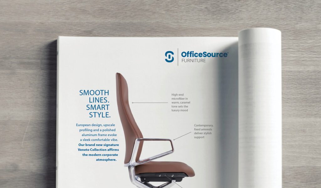
When it comes to graphic design, sometimes “nothing” is better than something.
Every project, large or small, starts the same way — with a blank page. Consider it a big empty cauldron, where design wizards deftly blend words and visuals to create the perfect potion to grab our attention, inform and inspire.
But what you might not have noticed is the secret ingredient every graphic design pro adds to take their recipe from ordinary to extraordinary. To the untrained eye, it looks like nothing at all. But this ingredient has the power to direct your readers’ eye to what matters most in the design, to install a sense of calm, to bring harmony and balance to any project. — It’s the magic of white space.
White space, also called blank space or negative space, is just what it sounds like — those areas of a project without text, pictures or graphics. It can be as small as the space between these words … or as big as the project itself! No matter the size, a good design uses white space intentionally. In a world filled with constant information, think of white space as the breathing room allowing your visuals to shine and your message to resonate.
Less is More
Too many design elements can quickly overwhelm a viewer. White space strips away the excess, giving room for those elements to make a bold impact — without the clutter. Good design uses white space like a road map, guiding your eye across the design and establishing a visual hierarchy. It ensures crucial elements like headlines or calls to action take center stage.
Emotional Punch
Think about how you feel in a clean and uncluttered environment. Those feelings of calmness and tranquility when your surroundings are quiet and organized can apply to a design project as well. By incorporating white space, you can create an emotional connection with your viewers, evoking feelings of peace and calm and creating an air of sophistication and luxury.
“White space is like air: it is necessary for design to breathe.” — Wojciech Zieliński
Clean design is a passion of our own design pro, Daria. Ideality is here to help you mix in the right amount of white space to take your project to higher level. From ad layouts to logo rebrands, let us help make your next project pure magic!


